The Art of Star Trek: Lower Decks — The Work Behind the Cerritos

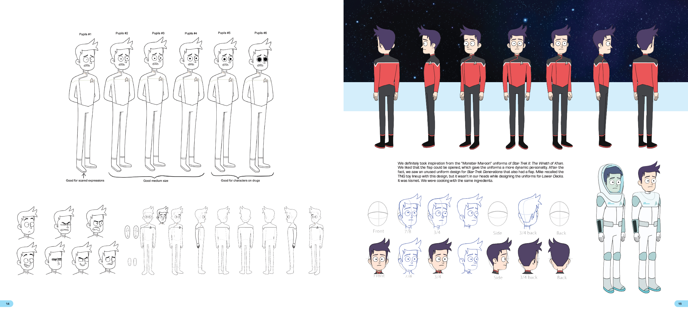
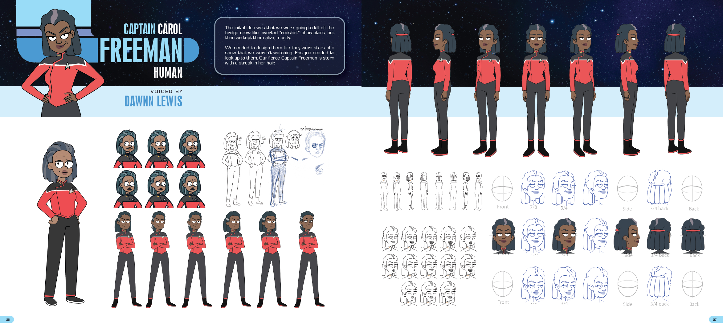
There is a row of Shaxs designs in this book that never made it to screen. A purple, troll-ish thing. A rounder one, closer to a bear or a koala. A scaled, lizardy variant that looks like it strayed in from a different show entirely. The grizzled Bajoran we ended up with is plainly the right call, but the pleasure of an art book like this is getting to stand in the room before that call was made. Tendi gets a quieter version of the same treatment a few pages earlier, a turnaround sketched and resketched with the designers’ own notes scrawled across it, smaller head, smaller eyes, redraw, each pass nudging her toward the character who finally reads as Tendi. That gap between a good idea and the final version is the most interesting thing in the whole book. Having written, lettered, and now and then coloured comics myself over the years, it’s the part I always go looking for.
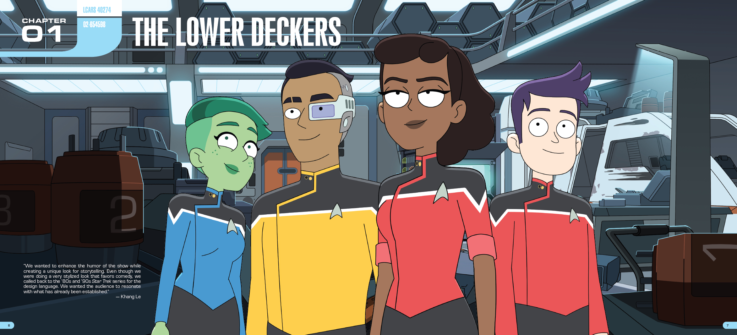
The Art of Star Trek: Lower Decks is IDW’s first proper Trek art book, which feels oddly overdue for a publisher that’s been producing Trek comics for nearly twenty years. The 344-page volume was assembled by Megan Treviño, with introductions from Mike McMahan and Barry J. Kelly. I should admit my bias up front. I love books like this. Give me concept sketches, production notes, and artists explaining why something changed, and I’ll happily lose an afternoon.
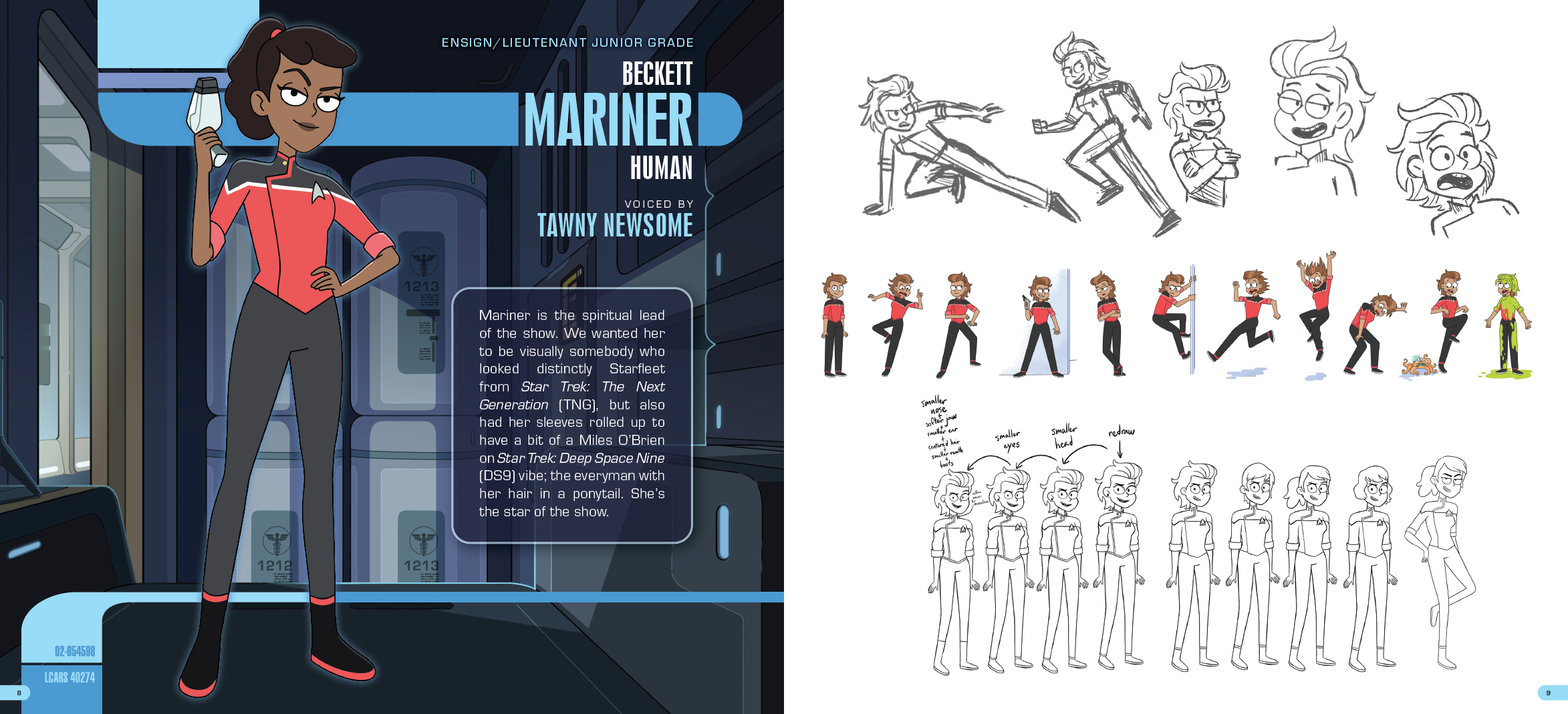
The book is built in a sensible order. It opens with the Lower Deckers, Mariner, Boimler, Tendi, and Rutherford, then the bridge crew, then the Cerritos herself, before five chapters work through the seasons and give every one of the fifty episodes its own spotlight. For my money the front third is the reason to own it. From around page ten the character work opens out into rows of expressions, alternate faces, and discarded silhouettes, and those pages on their own are worth the cover price. After that comes the ship, and the ship is where the book quietly makes its strongest argument.
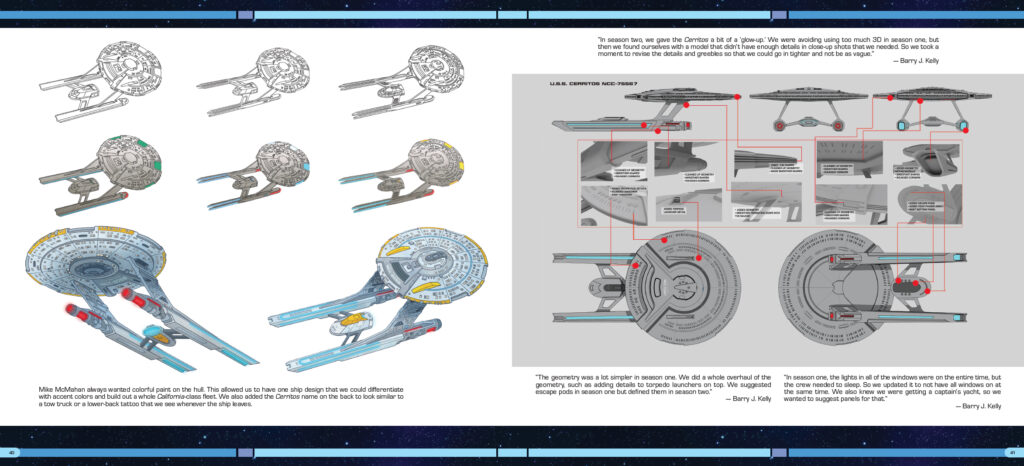
The Cerritos began life, the book admits, as a warmed-over Galaxy-class, roughly what the Enterprise-D might look like if you aged it forward a few decades. Then the design team gave themselves permission to stop doing that. The struts that hang the nacelles off the saucer were made deliberately clunky and industrial, closer to construction equipment than to anything elegant, and the nacelles themselves were shaped to read as skates.
As a teenager who spent a fair amount of time falling off one of those, I find a real satisfaction in the fact that the least glamorous ship in Starfleet has a skateboarder’s hardware bolted to the back of it.
There’s a tow-truck quality to the way the name sits across the stern, and the whole design leans into that working-ship feel. Kelly is good value on the practical revisions too, the season-two overhaul that finally gave the model the greebles and torpedo detailing the early version lacked, and my favourite note in the book, the small realisation that they couldn’t keep every window lit at once because the crew needed somewhere dark to sleep. That’s the kind of thought that only occurs to people who’ve decided the future ought to be liveable rather than merely pretty.
McMahan’s introduction makes the case better than any review could. His argument is that Lower Decks had to follow the rules of Star Trek harder than any Trek before it, precisely because it was the funny one. The references were never an Easter-egg hunt or hollow nostalgia. They were the price of admission. If Rutherford was going to love the warp core, the warp core had to look like a warp core, and that meant referencing every season and film that had aired before it, by hand, episode after episode. It’s the same instinct I’ve always rated in the show, the lore treated as something to honour rather than raid, and the book is full of evidence that the principle held all the way down to the props. Kelly puts a number on the labour that I keep turning over, somewhere near 17,500 shots across five seasons, made through a pandemic, a network change, and a writers’ strike. The book is partly a record of that, and it wears the effort lightly.
Some readers have criticised the environmental artwork for feeling oddly empty at times, but I think that’s largely a side effect of how animation production works. The backgrounds were created separately from the characters, and the book presents them in much the same way the artists saw them during production. As a record of the craft rather than an illusion of reality, it works perfectly well.
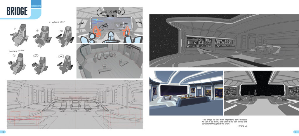
I spent as long on the object as on the art, which is an occupational habit left over from the lettering years. Nathan Widick’s page design is doing real work, threading the short text interludes through the art without letting either crowd the other, and the colour reproduction holds up to the kind of scrutiny a screen-accurate palette invites. There are double-page spreads that earn the format, and the LCARS material in the ship chapter is laid out with more care than that sort of thing usually gets. This is a well-made book before it’s anything else, which matters when the entire point is to sit and look at it closely.
What pleased me, and it doesn’t always happen with a book like this, is that the admiration and the enjoyment turned up together. You can respect the craft on every page of an art book and still feel as though you’re doing homework. This one kept pulling me back in, which is the higher compliment of the two.
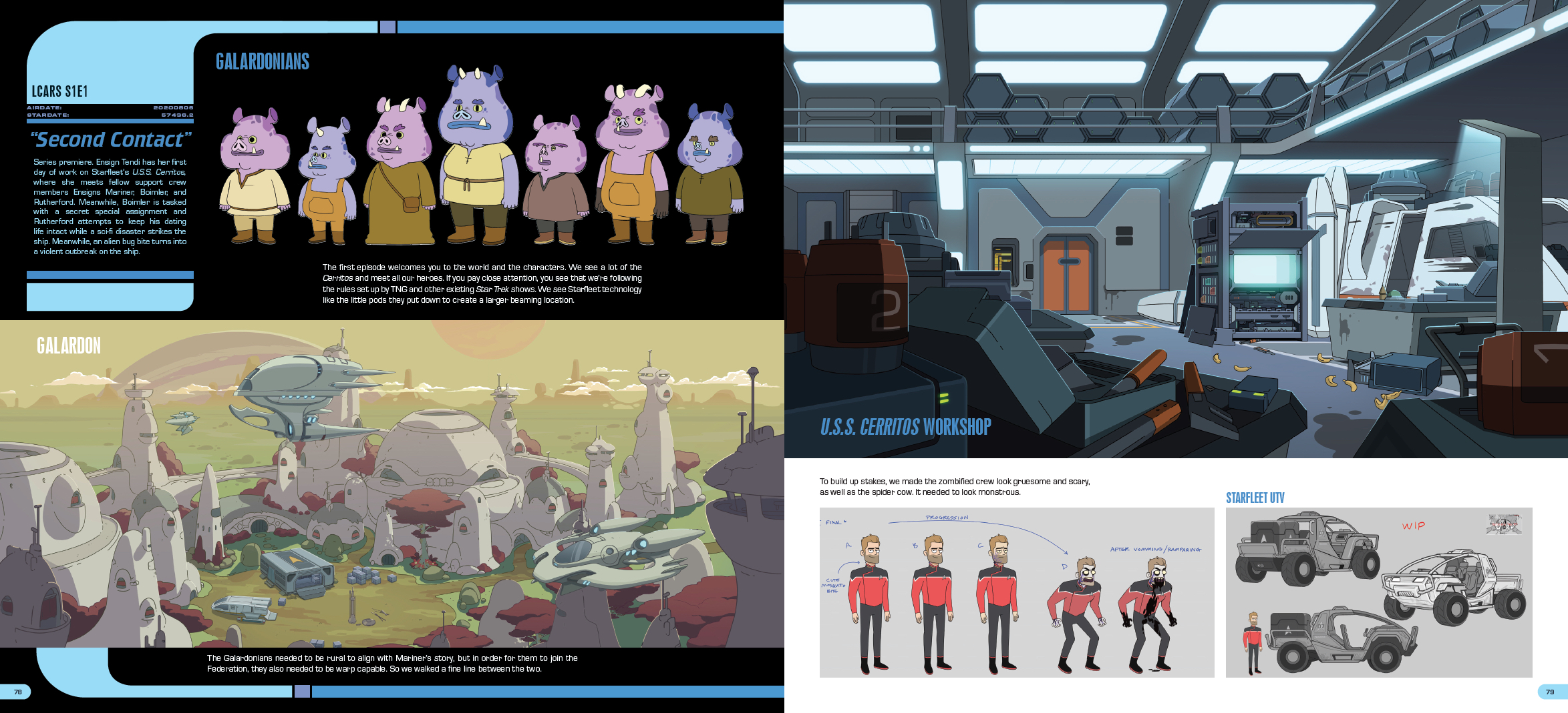
I’m not going to tell you to rush out and buy it, partly because I’d rather not sound like an advert and partly because you already know whether this is for you. If you loved Lower Decks and you want to see how it was put together, the book delivers that with care and obvious affection. If you’re after long-form interviews and a written history of the production, this isn’t that book, and it never pretends to be. It’s a generous, handsome record of a show that’s now finished, made by people who clearly didn’t want it to slip away without a proper accounting. Given how thin the Trek slate looks at the moment, that feels like a kind thing to have made. I’m glad it exists, and I’ll keep going back to those first hundred pages for a while yet.
8/10